Let's Talk!
Having project in your mind? We will help you choosing the suitable service for your business requirements.

Having project in your mind? We will help you choosing the suitable service for your business requirements.

| Project Designer | Deepanraj Maraimani |
| Role | Brand Identity & Visual Designer |
| Softwares Used | Adobe Photoshop, 3ds Max, Adobe Illustrator |
| Scope of Work | Branding, Packaging Design, Logo Design, Graphic Design |
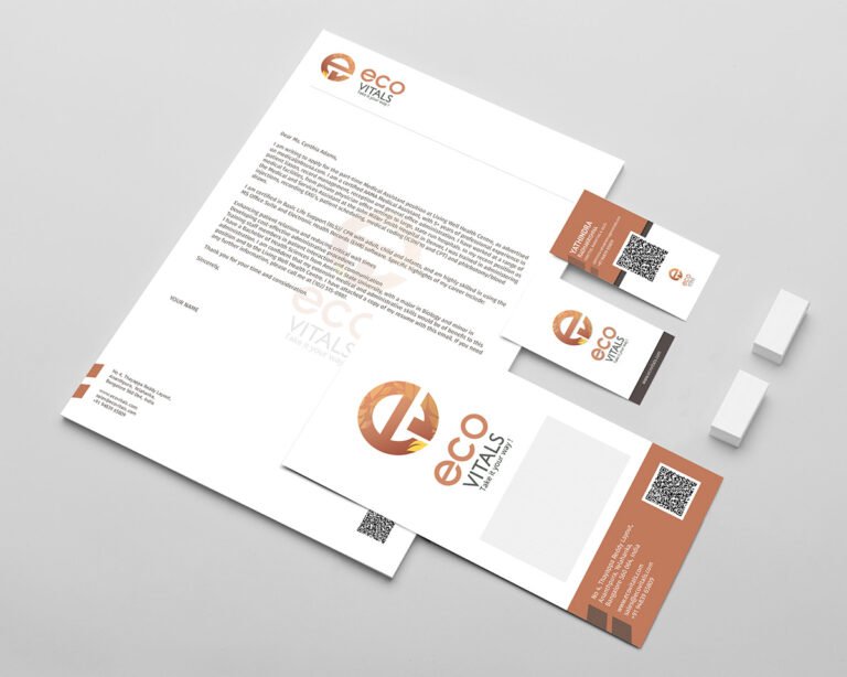
Eco-Vitals partnered with us to build a strong and purposeful brand identity that could reflect their mission of promoting sustainable, eco-friendly living. With their operations expanding in Bangalore and across India, they required a visual identity system that is modern, memorable, and aligned with their environmentally conscious values.
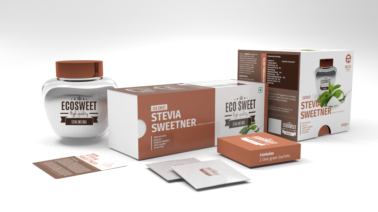
Eco Vitals approached Scroll Wide with a clear goal — to develop a fresh, premium, and health-forward packaging identity for their new stevia-based sweetener, Eco Sweet. As a natural alternative to sugar, Eco Sweet needed to visually communicate purity, wellness, and modernity, while standing out on retail shelves.
Scroll Wide was entrusted with crafting the complete packaging ecosystem, including:
Our objective was to create packaging that was not only visually appealing but also instantly conveyed the product’s natural, sugar-free, and zero-calorie benefits.
Eco Vitals wanted Eco Sweet to:
The challenge was to blend freshness, simplicity, and credibility into one unified identity.
We began by creating a clean and modern logo for Eco Sweet — one that reflects nature, purity, and lightness. The design integrates gentle curves and leaf-inspired cues to reinforce the product’s natural origin (stevia).
We curated a palette around fresh greens, soft whites, and natural tones to evoke health, freshness, and eco-friendliness. Minimalistic illustrations and clean typography were used to maintain a premium, easy-to-understand visual style.
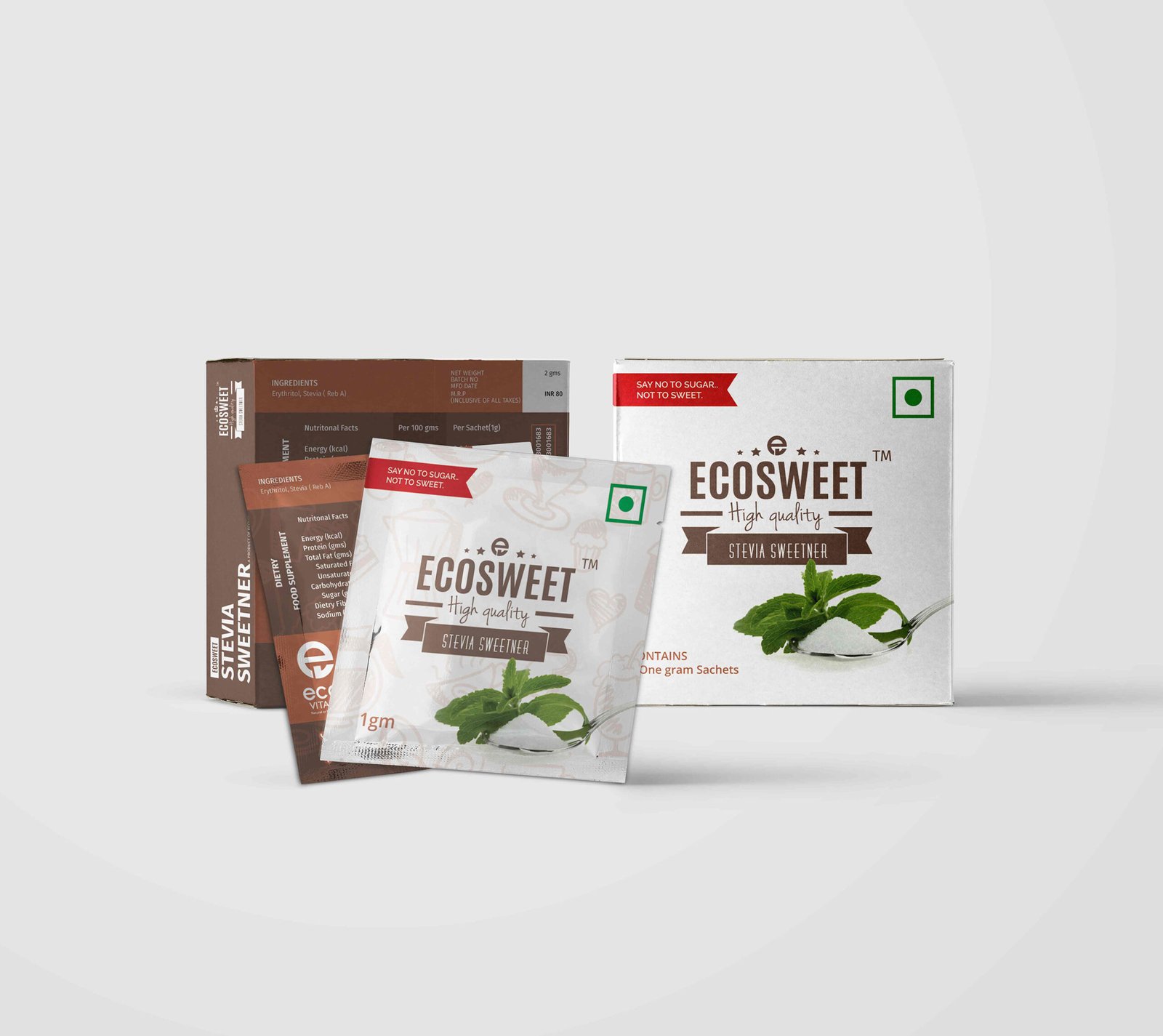
Scroll Wide developed a full suite of packaging that ensured consistency across product formats:
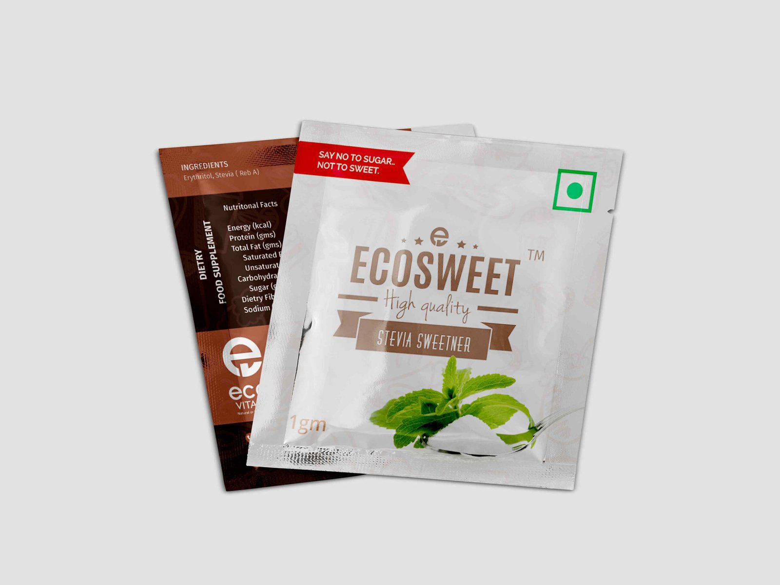
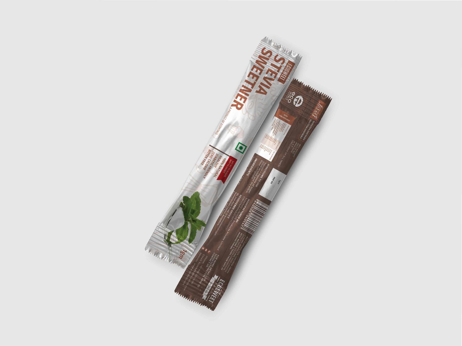
Compact, vibrant sachets created for daily use. Designed for clarity, quick identification, and on-the-go convenience.
A modern, sleek variation crafted with elongated slim packaging to enhance usability and appeal to café culture and fitness users.
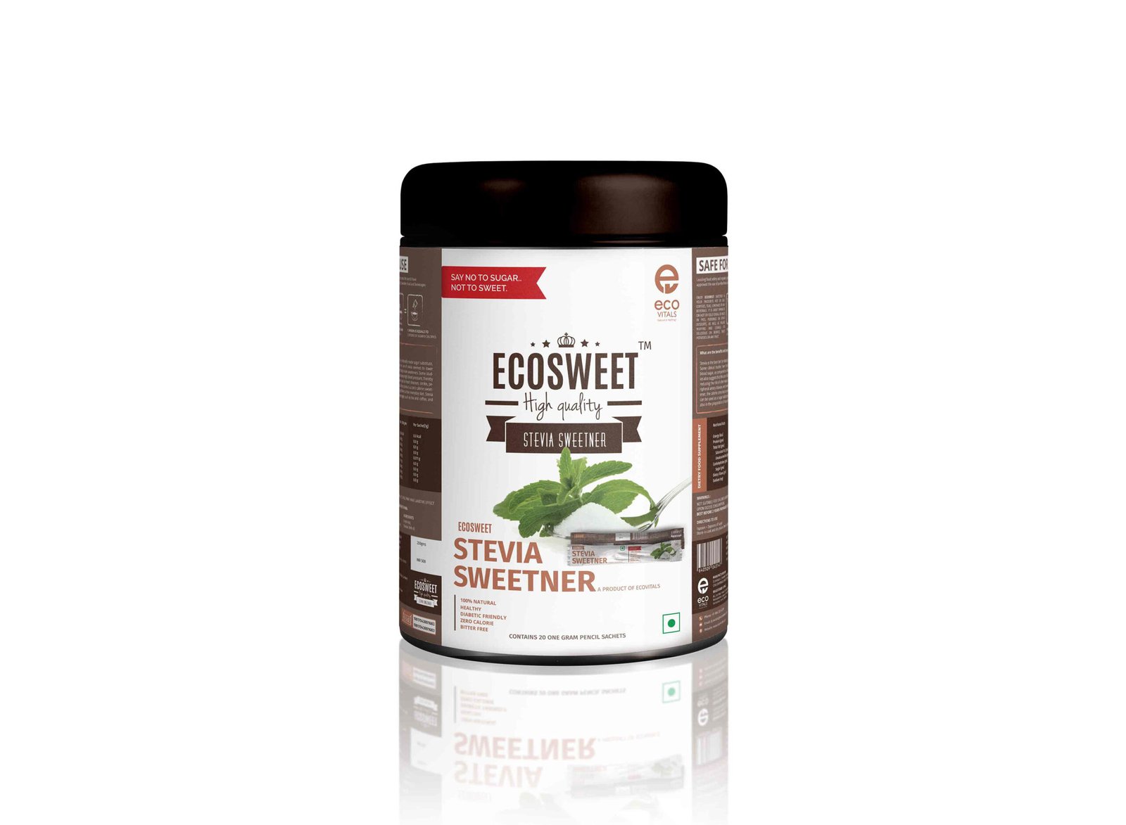
A structured, retail-ready bottle label with emphasis on the “zero calorie,” “plant-based,” and “natural sweetener” messaging. Designed for both shelf visibility and consumer trust.
Every packaging format incorporates the same brand elements, ensuring strong recognition and aesthetic harmony.
The logo is crafted to represent growth, vitality, and natural balance.
Clean geometric lines and organic shapes blend to form a mark that feels modern, trustworthy, and environmentally responsible.
Eco Sweet now stands with:
The complete design system helped Eco Vitals launch Eco Sweet with confidence, connecting effectively with health-conscious consumers and establishing a strong visual foundation for future product extensions.
Scroll Wide successfully transformed Eco Sweet into a visually compelling, retail-ready stevia brand through thoughtful design, cohesive packaging systems, and a clean identity.
This project beautifully demonstrates how strategic design elevates natural wellness products while maintaining simplicity and trust.